Want to enable your B2B transformation?
Zooma is your strategic and practical partner for transforming how you market, sell and serve your customers. Experience tangible business results with our expert team, dedicated to driving your success.
Trusted by leading B2B brands and teams


Struggling to transform your B2B business?
At Zooma, we help B2B companies become self-reliant in their desired transformation by fusing strategic advice, digital activation, and hands-on implementation. With +25 years of expertise and a diverse team of 25 specialists, we advise, deliver and drive your brand, sales, marketing and service initiatives. Trust Zooma as your go-to B2B powerhouse.
Why
Experience the difference of a Zooma partnership
We help B2B companies implement HubSpot, optimise marketing, sales and service processes, and create long-term results. Our +89 NPS score tells us we take the right approach.
Proven track record
Comprehensive approach

B2B experts
Outcome-focused
A three-phased approach
In all our projects we explore possibilities, refine strategies, and deliver impact.
Phase one
Explore possibilities
Uncover new opportunities
Our first step is to explore the possibilities that correspond to your challenges. We work collaboratively to identify the best approach to achieve your desired future state.

Phase two
Refine strategies
Maximise your outcomes
In this phase, we optimise results by refining the details of the approach. Our focus is on ensuring that every activity contributes to your business objectives.

Phase three
Deliver impact
Drive meaningful change
Finally, we deliver impact by implementing the refined approach, ensuring it resonates with your ideal customer profile. Our commitment is to achieve tangible results.

Customer testimonials
With excellent knowledge and high ambition regarding online, communication, brand building and digitalisation, Zooma has helped us as a company to take a gigantic leap forward. I am very grateful to have been given the opportunity to take on the online and digitalisation challenges together with Zooma.
Mattias Sjöstrand
Mölndal Energi
We began the HubSpot journey with Zooma as an experienced partner by our side. Marketing, sales, and service teams are working in HubSpot and we can see the advantages of having all data in one place. One of the main reasons for this successful implementation is Zooma. Because Zooma can understand the business needs and has a structured way of working. Also, the team members are up-to-date, outside the box thinker, and supportive.
Alireza Abbasi
Interwheel
Zooma is a good partner to discuss your online challenges and oportunities with. They are quick and easy to work with and they bring up own ideas and reminders what needs to be done.
Klas Rapphed
Metenova, a Repligen Company
Zooma manage to combine fantastic expertise and professionalism with a warm, social, and welcoming feeling, which makes them very inspiring to work with. They are attentive and can turn your thoughts into a visual product. Things that are difficult to explain, they understand impressively well and manage to visualise those thoughts. They work methodically and always deliver what is agreed upon and more. I can highly recommend Zooma Agency for all kinds of web and marketing projects you might have.
Jonas Karlsson
Tilka
Case studies
Discover what some of our customers have accomplished.
Tilka
.webp?width=800)
Metenova
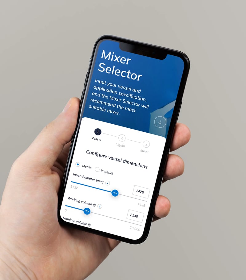
I've been working together with Zooma for many years and for a number of different companies. And there is a good reason for me to keep coming back.
Johan Fredriksson
Digital Marketing Manager, Bee Charging Solutions
Novar
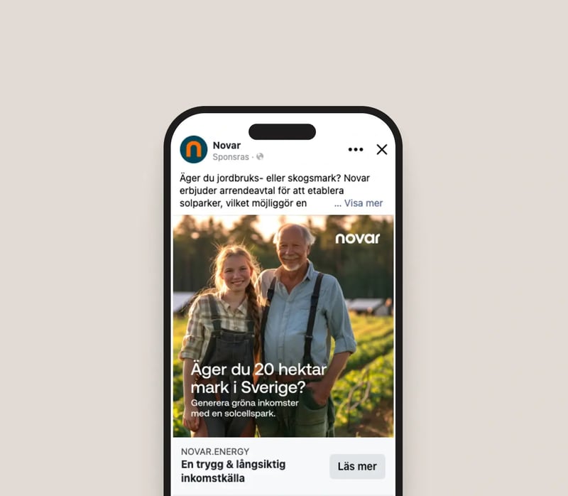
Join our clients

Services
Comprehensive offering for B2B enablement
At Zooma, we provide a robust framework to elevate your B2B business. Zooma offers the suite of services you need to transform your brand, marketing, sales, and service.
Advice
Foundation
We help you shape a relevant strategy and roadmap tailored to your goals and ambitions. We provide analytics to make informed decisions, enhance your branding, and embrace innovation and AI for future success.
Create
Platform and experience
We design and create engaging digital experiences, solutions and content that stand out. Our team handles implementations, migrations, and integrations to ensure seamless platform transitions.
Drive
Activation and reach
Our performance marketing strategies turn campaigns into tangible results. We specialise in email and ABM campaigns, alongside comprehensive training for sales, LinkedIn, service, and marketing enablement.
Ready to get in touch?
Book a meet and greet session with a Zooma expert today — no obligations at all.

FAQs
Answers that help you make informed decisions.
The B2B Enablement Hub
Explore relevant insights
Stay ahead with expert content for B2B leaders.

Are sales teams often the last to embrace change?
When buyers are increasingly digitally savvy and market dynamics shift swiftly, sales teams should be at the forefront of adaptation. Yet, observations suggest that sales departments often lag in embracing change.
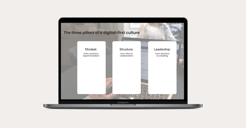
Digital transformation's biggest obstacle isn't technology - it's you!
In B2B, clinging to outdated methods is a surefire way to become obsolete. Digital transformation isn’t just a buzzword; it's the lifeline your organisation desperately needs. Yet many companies remain shackled by misconceptions, treating digitalisation as a mere IT upgrade rather than the radical overhaul it demands.

From doing digital to being digital
Digital transformation involves more than just adopting new technologies—it's about rethinking your entire business strategy. Many transformations fail due to natural resistance to change and a tendency to cling to outdated cultures.
The Bulletin
Discover the latest news
Keep up with the latest updates from Zooma and our friends.

Continuing to support Göteborgs Stadsmission
In Gothenburg, not everyone has the same conditions. There are families and individuals who struggle to make ends meet, and for many of them, Göteborgs Stadsmission is an important part of everyday life.
%20scale%20from%20unhappy%20to%20happy%20faces%2c%20with%20a%20high%20score%20(+93)%20shown%20beside%20it.webp?width=800)
A new milestone: NPS +93
A sincere thank you to everyone who contributed to our latest Net Promoter Score (NPS) survey. Your time, feedback, and openness are invaluable to us. We are proud to share that we have reached an NPS of +93, our strongest result to date.
Zooma turns 25 today. And leaning forward.
Today—April 10—Zooma turns 25. That’s a strange sentence to write. This statement isn’t to imply that 25 years isn’t a noteworthy achievement. It is. The work itself has never felt stale or burdensome. Or heavy. Or routine. What’s even stranger, and perhaps more telling, is this: it has never felt like “I have to go to work.”
The Tech Hub
Dive into the world of tech
Discover Secret Tech Club, a video series that breaks down tech topics through stories, conversations, and sketches.

Secret Tech Club EP04: Lost in connection
APIs are the unsung heroes that enable your apps to communicate behind the scenes. Whether you’re here for the technology or simply to watch middle-aged men reach their endpoints with epic dad puns, you’re in for a treat.


Secret Tech Club EP03: Copycats
Generative AI can do it all: paint, write, compose. And in this episode, it also dropkicks my confidence, creative spirit, and romantic prospects. Come for the demos, stay for the emotional damage.


Secret Tech Club EP02: Bright future
Stellan is head over heels for AI coding. Me? I'm not so sure. Is this really a developer’s dream come true, or the beginning of the end?
