
Here’s an early Halloween story for online or web editors: The meticulously phrased and, just five minutes ago, perfected headline you created looks totally hideous on a smartphone. The long sophisticated word that you found in the thesaurus reminds you of how bad that stylish shirt you just bought fits. What to do?
This is the first blog post in Zooma’s series ‘Improve your online presence’, where we will provide tips and tricks, or secrets if you would, that will finally make you a master over your online presence.
The thing with online and the modern web is that it must adapt to the screen your device uses, which means that the layout, design and typography have to change accordingly to improve the experience. Which is a good thing of course, because smaller screens benefit from bigger buttons and larger font sizes. But as a result, longer words that look good on desktop might become longer than the actual line-width on a mobile device, causing them to be cut off or in worst case break the layout. Web typography has come far, but browsers still don’t know what to do with something that doesn’t fit, at least not in an intelligent way. It’s a bit like feeding a hungry animal that can’t tell when it’s full already.

Don’t worry, your web browser won’t explode, but your .com/.xx might look a varying degree of broken.
Come on closer, don’t be shy
I will now just rudely assume that you know what HTML is and introduce the first trick in this blog series, the HTML entity ­, and explain to you how this magical code is used. Let’s take a look at this word, which incredibly enough is a real word:
‘Supercalifragilisticexpialidocious’
This will definitely not fit in your normal mobile layout, so what to do? We could just add some hyphens/dashes (-) and let the web browser hyphenate the word for us, right?
Nope, take a look at what happens when we resize the screen:

Hyphenating is the way to go, but we need to do so intelligently, and only when necessary. Here’s where the entity ­ comes in. The acronym stands for ‘Soft Hyphen’, but when considering that it’s an invisible character that only reveals itself when absolutely needed, I think the ‘shy’ notion fits it perfectly.
To use this entity in the title field, you simply paste/insert/write it at the place(s) you wish to allow your word to be hyphenated. For instance:

Which gives us this:

Marvellous, right?
Your post title obviously looks a bit weird now in the admin pages, at least in the eyes of those who are unfamiliar with the entity, but that’s about the only downside: Search engines see it as formatting which means that only the actual words are indexed.
You didn’t think I would teach you a cheap hack that would break your SEO, right? You will find none of that here.
Please note that I cannot guarantee that you will be able to do this directly in the title field if you’re using a Web Content Management System (WCMS) other than HubSpot. It should work though so don’t be afraid to try.
What if I want to hyphenate the other headings?
Glad you asked. You cannot write HTML entities or tags directly in rich text editors, since their job is to take what you’ve written and translate it into—you guessed it—HTML markup. Your ­entity would just appear as text and not do what you intended it to do.
In order to use HTML in the body, you will need to access the source code. Most if not all modern WCMS platforms let you do this, either through a button, menu or a tab. Below is a screenshot of how you enter the source in HubSpot:
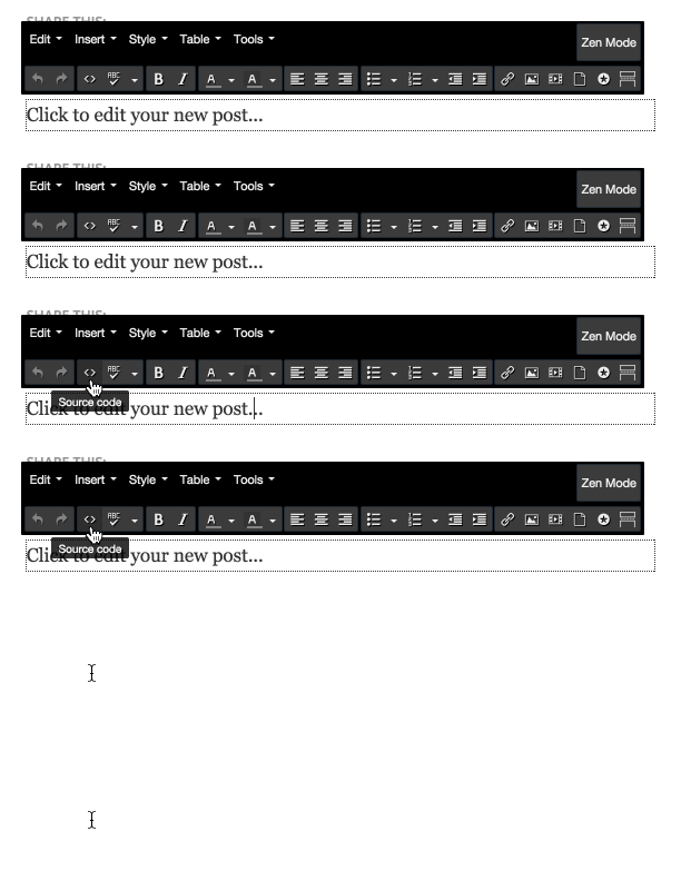
What you will see in here might scare you, especially if you’ve never seen HTML markup before. Depending on what WCMS you’re using, you will see a different degree of mess and necessary evil.
I will not go into details about how HTML works, but it should be pretty safe for you to just search for the word you’re looking for and insert the entity where you want it. Just don’t forget to save your changes.
Wrapping it up
I hope you enjoyed the first part in our ‘Improve your online presence’ series, and do let me know if you’d like us to cover something else in this topic by leaving a message in the comment form below!