Since we’re often asked what constitutes a great CTA (short for Call-To-Action) we thought we’d give you our take on the subject. We’ll go through some of the principles one needs to think of when creating a CTA, and then look at examples based on real-world data. Curious to know what the conclusion is? Then this article is for you.
What is the purpose of a CTA?
Calls-to-action (CTAs) are a key part of any inbound approach since they connect incoming visits with opportunities to convert into leads. Or as defined by Wikipedia:
‘In marketing, a call to action (CTA) is an instruction to the audience to provoke an immediate response, usually using an imperative verb’
Use CTAs in everything you do; e.g. email, blogging, offsite, landing pages, thank you pages etc. to guide visitors to (for them) relevant and important content.
What to think of when writing your CTA copy?
- Use actionable language, e.g. think ‘Download product sheet’ instead of simply a link with the name of the product sheet.
- For CTAs that lead to another page, align the copy of the call-to-action with the headline of the landing page copy. Users don’t like click baits with disappointing content behind them.
- And for CTAs on landing pages, remember to include a clear value proposition; what is the value I am going to get in exchange for my contact information?
That sounds great, so what actually works?
Looking at some of zooma’s friends we have gathered a few examples of CTAs that serve their specific purposes really well, i.e. proof that they work is in the numbers.
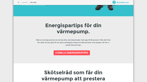
8 simple energy saving ideas (click to view)

What’s great? The content of the CTA is very well matched to the purpose of the page (to provide practical hints and advice), it’s the first CTA on the page and the copy is straight to the point. It is also fully aligned with the landing page. What to improve? The language could be more actionable, e.g. simply add a ‘Hämta’ in Swedish (‘Get’ in English) at the beginning.
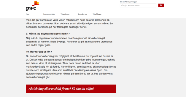
Corporation or sole proprietorship? This is how to choose! (click to view)

What’s great? It is actionable and very well tailored to be a continuation of the subject of the article (10 common questions when starting a corporation). It is also fully aligned with the page it is linking to (another blog post with the exact title of the CTA). What to improve? Create a content offer on the same subject for a deeper dive and the chance to convert visitors into leads!
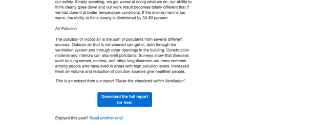
Raise the standards within Ventilation (click to view)

What’s great? Again, it is actionable (starts with ‘download’) and in this case also points out that you get the report for free (and with exclamation mark!). As all the other good examples it is very well tailored to be a continuation of the subject of the article (why we need good ventilation) and is fully aligned with the page it is linking to (a content offer with the exact title of the blog post). What to improve? Increase the width of the CTA to avoid two rows / make it simpler to read.
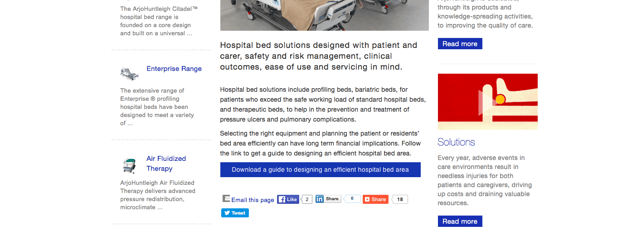
Guide to designing efficient hospital bed area (click to view)

What’s great? It is actionable and talks about efficiency which is a key aspect of hospital design for targeted personas. It’s presented on relevant pages (not only this particular one) where it naturally fits in. What to improve? Make it even more prominent. It is surrounded by other types of calls-to-action, e.g. social sharing buttons and read more CTAs which are all drawing attention away from this specific CTA.
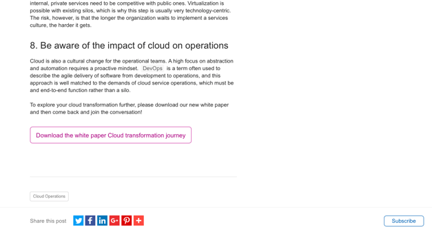
Cloud transformation journey whitepaper (click to view)

What’s great? Again, it has the mentioned major themes of a great CTA in that it is actionable and aligns perfectly with the subject of the article (‘The 8 pitfalls to avoid in your cloud transformation’) and is well aligned with the landing page it is linking to. What to improve? Add the fact that it’s for free!
The main conclusion? Trust the numbers!
You probably think a few of the above examples aren’t to your particular taste, and that’s an important learning. Creating great CTAs is a numbers game. You should get going, learn what works with your audience and then simply do more of that! Knowing exactly what will work best from the outset is going to be very difficult, other than following the three best practices above.


